Eliza-Wrapped 2025
TL;DR I ripped off Spotify’s Wrapped feature (again) and created my own version.
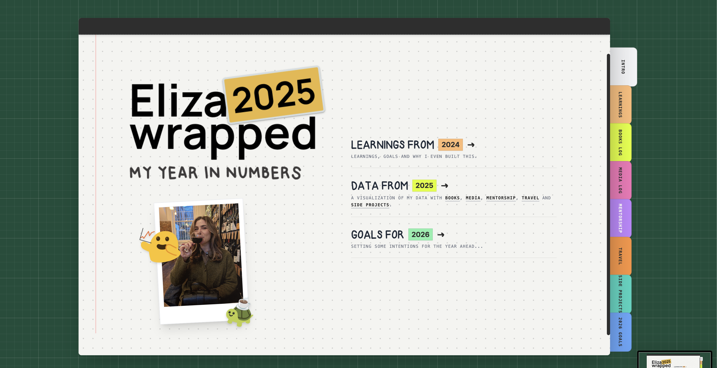
A screenshot of the final product
Learnings from 2024’s Eliza-wrapped
While I enjoyed the process of creating last year’s wrapped, there are several things that I would have differently.
I started off being data-centric then got lazy
Apparently you can only upload square posts on Instagram for web
Looks bad on desktop
Sources were not clearly displayed
What I learned from last year’s wrapped
Goals for the 2025 version
Learning from the constraints of social media platforms, this year is web-first.
Utilize new technologies like AI vibe coding to create a responsive experience
Lean into data visualization
Maintain my personal touch with a nod to my desk mat and journal
Data collection
Identifying data
To begin I needed to determine all of the data that I had available to me.
Books from GoodReads
Media from Spotify, YouTube and video game platforms
Mentorship from ADPList
Travel from Google Maps
Side projects from my website
Site map for the prototype
Spreadsheet with my 2025 data
Structuring data
To ensure that my AI tooling could analyze and display my data, I had to provide it in a way that the AI could consume. This included the following tasks:
Collecting data in a single spreadsheet
Converting spreadsheet to CSV file
Prompt refinement
1. ACTOR You are a Senior Creative Frontend Engineer specializing in Skeuomorphic Design, CSS 3D Transforms, and Data Visualization. You excel at creating tactile, organic web experiences that feel like physical objects using React, Tailwind CSS, and Framer Motion.
2. BACKGROUND We are building "Eliza-Wrapped 2025," a personal "Year in Review" site similar to Spotify Wrapped, but presented as an interactive digital journal. The target audience is friends and family. The vibe is intimate, handmade, and nostalgic.
3. OBJECTIVE Create a single-page React application that simulates a physical open book/journal on a desk background.
- The central interaction is a "Page Flip" mechanism where the user moves forward/backward through the story of the year.
- Each page spread (left and right) displays different data visualizations and "scrapbook" style content.
4. STYLE
- Tech Stack: React, Tailwind CSS, Framer Motion (for the page flip physics and sticker animations), Lucide React (for icons).
- Aesthetic: "Digital Scrapbook." High-texture paper backgrounds, slightly rotated elements (photos, notes) to look imperfect and handmade.
- Typography: Use a Google Font like 'Permanent Marker', 'Indie Flower', or 'Patrick Hand' to simulate Elizabeth's handwriting.
- Visuals: Use CSS borders and drop shadows to simulate "Polaroid" photos and "Washi Tape" holding elements down.
5. STIPULATIONS
- Responsiveness:
- Desktop: Show a full open book (Left page + Right page).
- Mobile: Show a single vertical page stack or a single page view that slides/swipes.
- Navigation: Users must be able to click the page corners, use arrow keys, or click "Next/Prev" buttons to flip pages.
- Data Structure: Create a
const yearDataarray containing mock data objects (e.g., "Coffees Drunk," "Countries Visited," "Top Songs") to populate the pages. - Assets: Since we don't have the custom font or images yet, use
https://picsum.photos/for realistic imagery and the Google Fonts mentioned above as fallbacks. - Interactions: Elements (stickers/photos) should have a subtle hover effect (scale up 1.05x and slight rotation) to feel tactile.
Vibe coding
Applying styling
It’s important to get the prototype working properly before jumping into any sort of visual changes. I would also recommend saving your progress by duplicating your project before you’re about to make a significant change.
Getting images into AI Studio
One of the limitations of Google AI Studio is that it does not store images or videos for you. I’ve found a couple of ways to get around this:
Creating a Github repository and providing the RAW link to the agent to display
Use existing public images and provide the URL to the AI
Creating my own font
For the website to fully reflect me, I created a typeface of my own handwriting and uploaded it into my prototype. Upon later reflection, I realized that I forgot to do numbers which was a big miss.
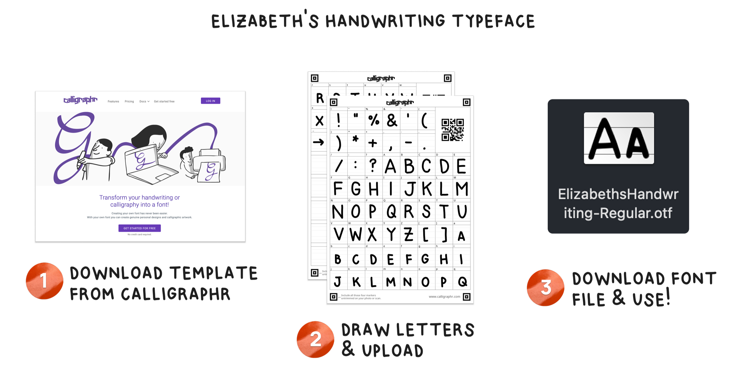
A walkthrough of how I made my handwriting a font. You can make your own typeface on Calligraphr
Embedding widgets to expand functionality
Some of my data sources allow me to embed real-time information and functionality. I decided to include my personal reviews and availability from ADPList and fed the code to my AI agent.
Debugging
Data visualization bugs
I had several instances where the data visualization would appear properly and then suddenly break after I made a (seemingly) unrelated update. I phrase my feedback as if I am speaking to a front end engineer and ensure my prompts are detailed.
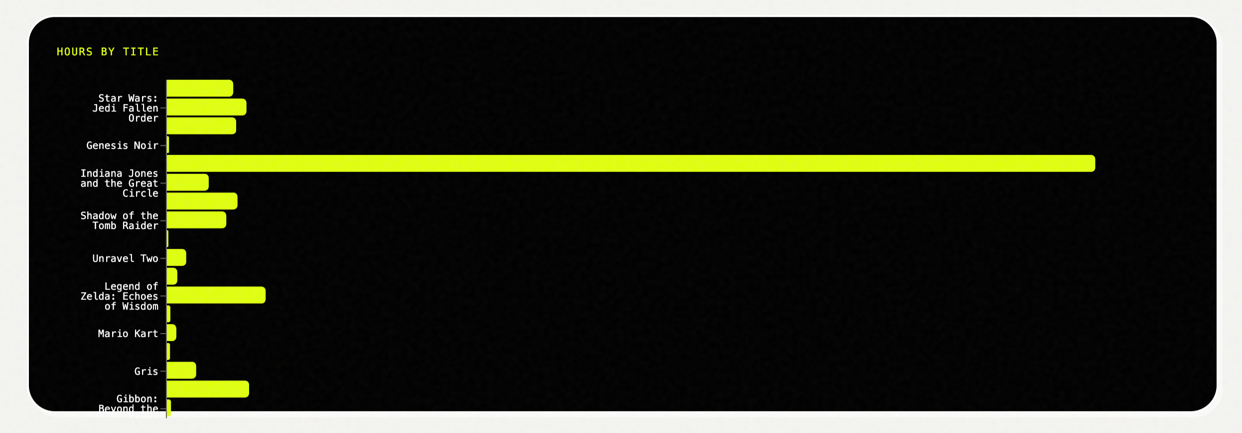
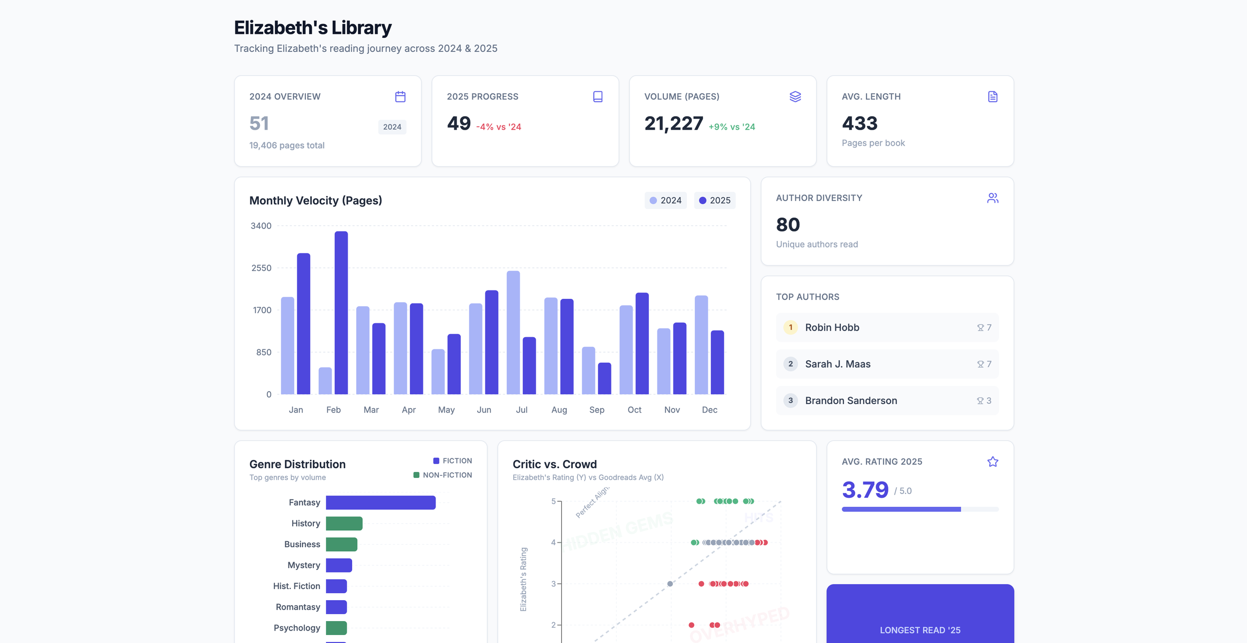
Before: the data visualization was rendering in a weird way, making it difficult to read.
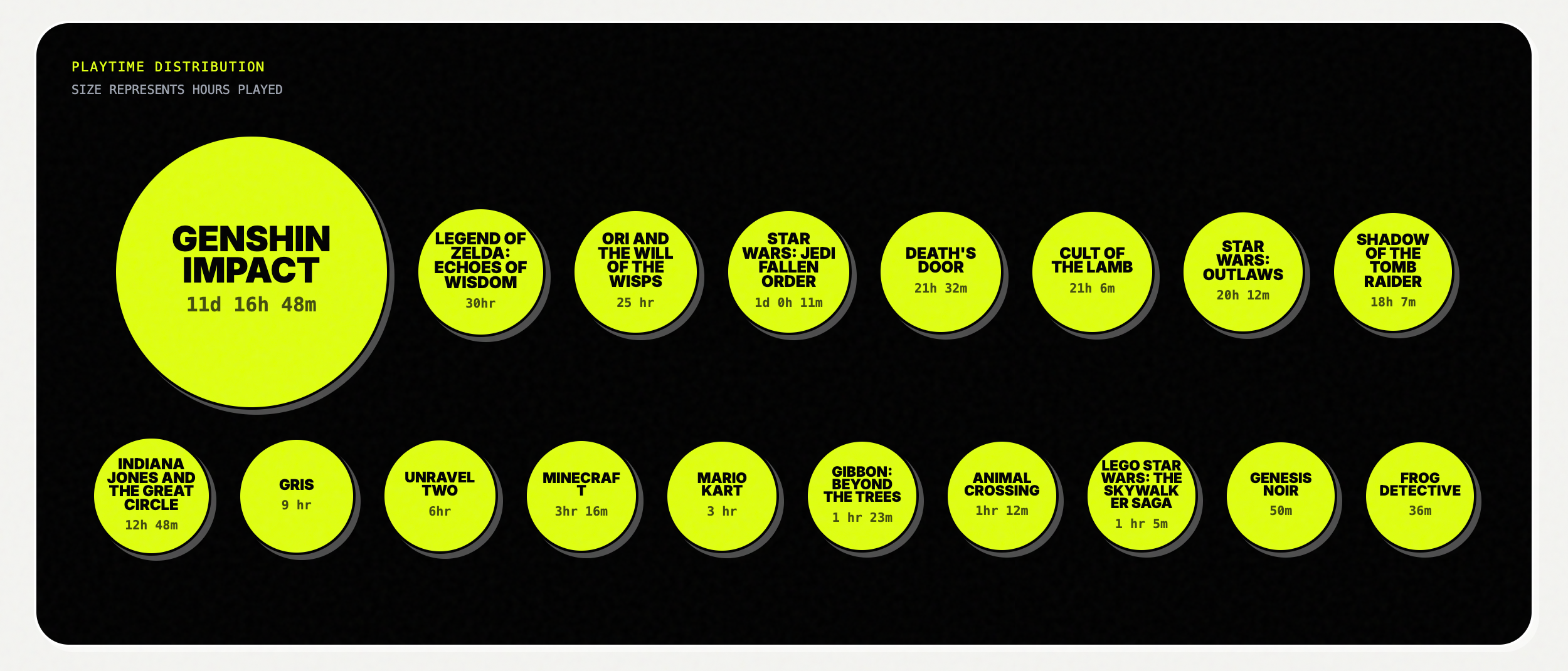
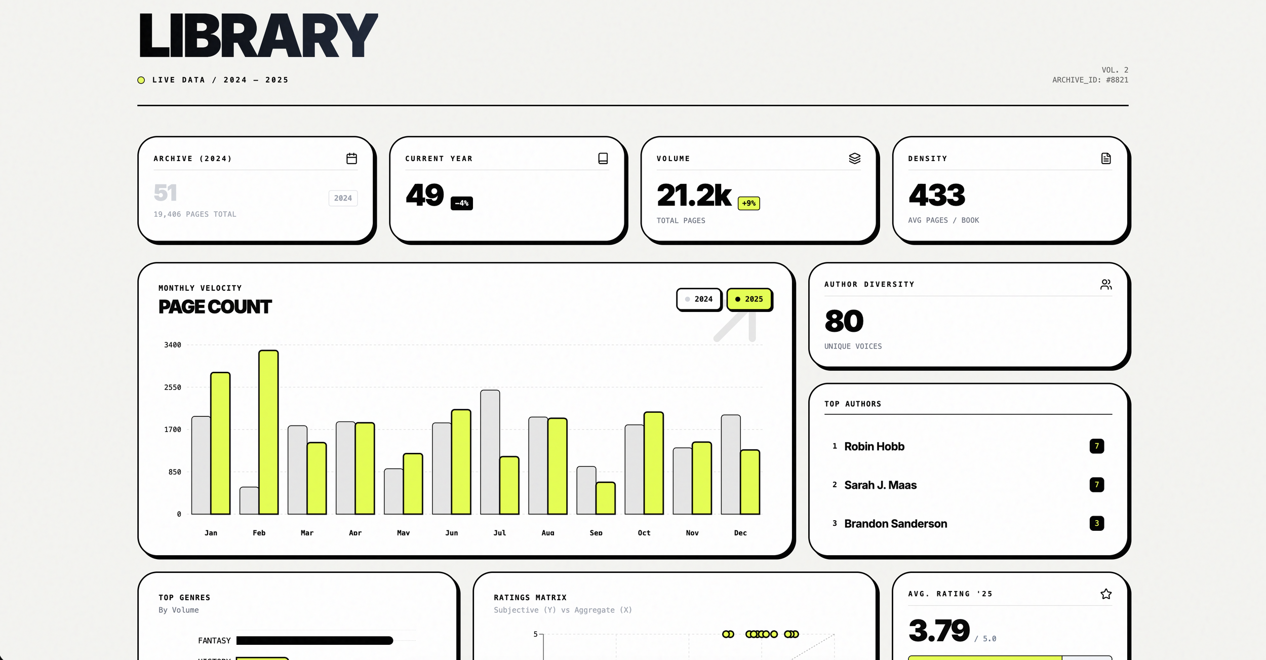
After: Data is visualized in a more appropriate format that allows for better legibility.
Responsive design
While AI Studio did a fairly good job at creating responsive layouts, there were a few instances where I had to provide wireframes for it to adjust the layout to something that I felt worked better.
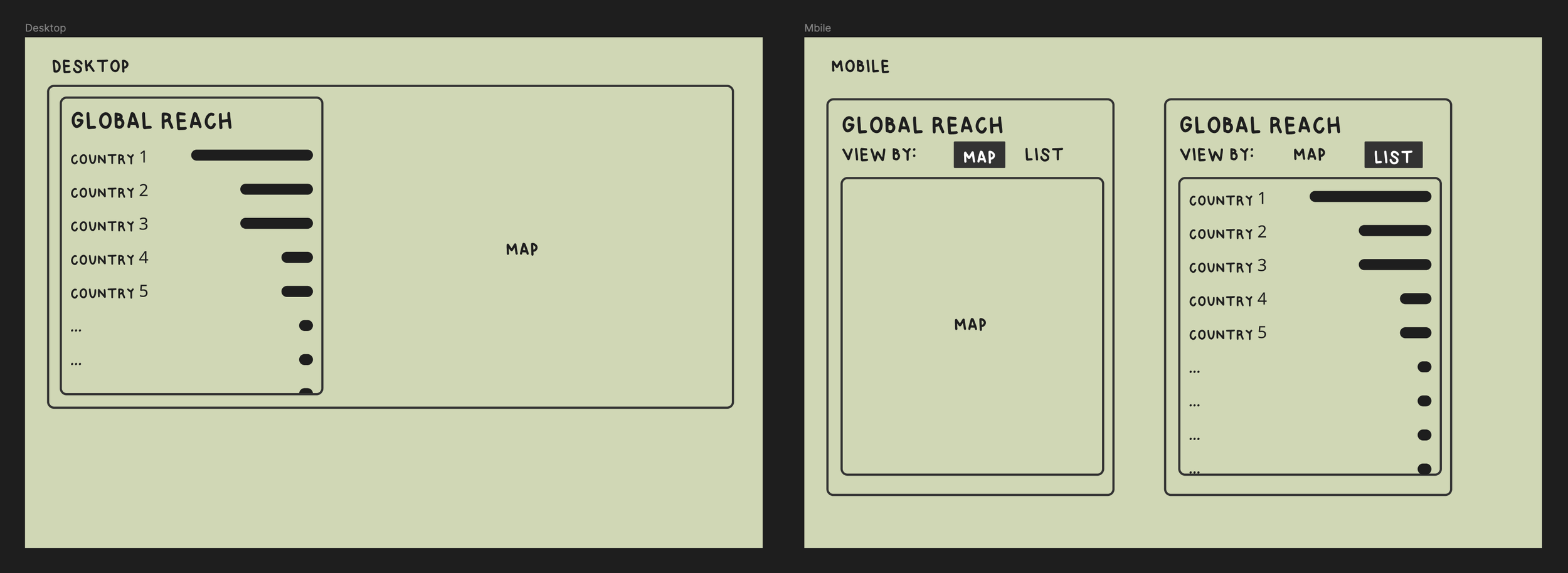
Wireframe that I provided to my agent to change the layout of a map feature
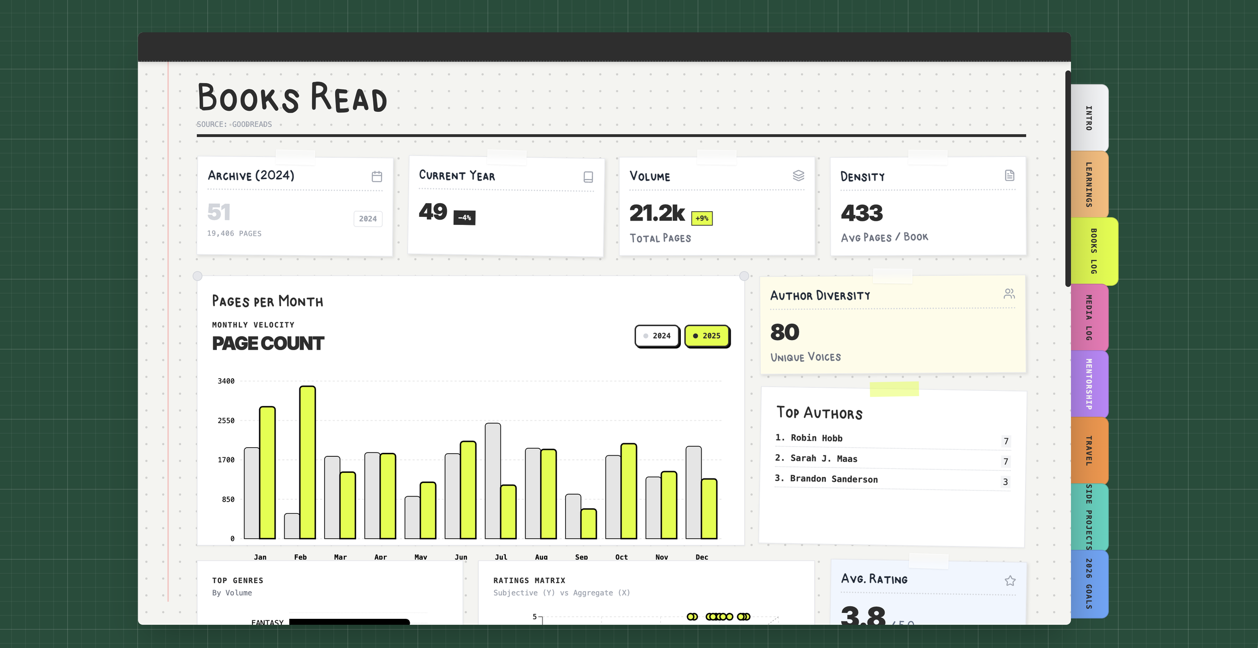
Final product
Learnings from this year
Make a typeface with numbers: Somehow I forgot to do the numbers when I did my last typeface, which is a major miss when doing a whole project about data…
New technologies: Use each project as an opportunity to learn a new skill