QUILL
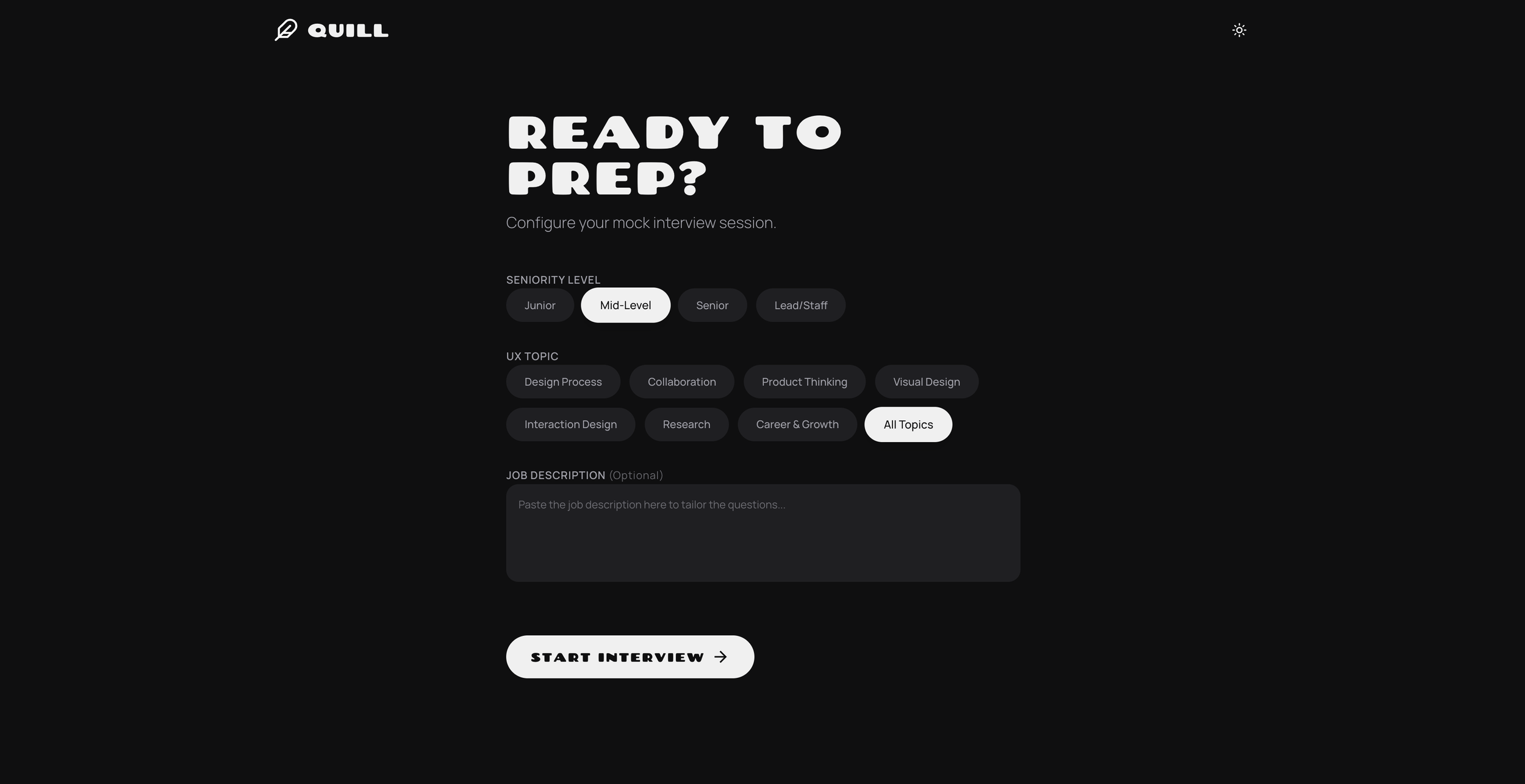
TL;DR I created QUILL (Qualitative UX Interview Logic & Learning), an interactive bot that helps UXers prep for upcoming interviews.
Background
Problem
As an active mentor on ADPList, I find a lot of my mentees are looking for interview prep. There can often be many different stages within a UX interview process, with many questions that UXers are expected to know. This can feel daunting, especially for those new to the field.
Insights from my mentorship sessions
65% of my mentees (28 out of 43) specifically sought guidance on interviews and the job application process, ranging from strategic advice for "Big Tech" roles to technical interview practice
Over half of mentees (51%) requested detailed feedback on their portfolios and how to best present their work
Nearly 1 in 5 mentees (18.6%) requested a live "mock" practice session, indicating that simulating the pressure of a real-time portfolio run-through or behavioral round is a high-priority need
25.5% of mentees (11 out of 43) asked for guidance on storytelling and presenting case studies or slide decks, emphasizing the importance of "quantifying impact" to demonstrate seniority
Goal
Provide UX designers the right level of feedback to help them confidently prepare for UX interviews. QUILL should be able to analyse the UXers responses and provide guidance on how to improve.
Questions UX designers have:
How good was their response? Would it pass in an interview setting?
What is the TL;DR of the feedback?
What worked well?
What needs to be improved?
What would a good answer look like?
Critical User Journey (CUJ)
As a UX designer, I want to ace my interview, so I prepare by answering practice questions and getting actionable feedback on how to improve.
〰️〰️〰️〰️〰️〰️〰️
〰️〰️〰️〰️〰️〰️〰️
Process
Collect sample questions
To ensure high quality and accurate questions, I provided my AI tooling with a list of questions that I prepared for each part of the interview process. This list is used to create a standard for newly generated questions.
Example of a standard UX interview process
-
Tell me about yourself and your background in UX design.
What interests you about this specific role and our company?
What is your understanding of the role and what we do?
Could you walk me through your experience with [mention 1-2 key skills or tools listed in the job description, e.g., Figma, user research, working in Agile]?
What are you looking for in your next role?
What are your salary expectations?
What is your availability for interviews?
What is your notice period in your current role?
Why are you looking to leave your current position?
Have you applied to other positions, and where are you in those processes?
Do you have any questions for me about the role or the company?
-
Tell me more about your journey into UX design and what drives your passion for it.
Can you walk me through your typical design process from start to finish for a project?
How do you approach understanding user needs and goals at the beginning of a project?
What role does user research play in your design process, and what methods are you most comfortable with?
How do you translate user research insights into design decisions?
Describe your experience working with different stakeholders (e.g., product managers, engineers, marketing). How do you collaborate effectively?
How do you handle receiving feedback on your designs, especially if it's critical?
Can you discuss a project where you faced significant constraints (time, technical, resources) and how you navigated them?
How do you prioritize your work when you have multiple competing tasks or projects?
What design tools are you most proficient in, and how do you choose the right tools for a project?
How do you stay up-to-date with the latest UX trends, tools, and best practices?
What are your strengths as a UX designer?
What areas of UX design are you looking to develop further?
Can you tell me about a project you're particularly proud of and why?
How do you measure the success of your design work?
What is your philosophy on [UX concept like accessibility, information architecture, interaction design]?
How do you advocate for the user in a business context?
What kind of team environment do you feel you thrive in?
Do you have any questions for me about the team, our design process, or the company culture?
How are you using AI in your design process?
-
Process and Design Thinking
How did you identify and define the problem you were trying to solve?
How did your research inform your design decisions? Can you give specific examples?
How did you prioritize features and design elements? What trade-offs did you consider?
What design patterns or principles did you apply, and why?
How did you consider the technical constraints and feasibility of your design?
Role and Collaboration
Who did you collaborate with (e.g., researchers, product managers, developers, other designers, data science)?
How did you effectively communicate your design ideas and decisions to stakeholders?
How did you handle disagreements or competing priorities within the team?
Can you give an example of a time you advocated for the user?
How did you hand off your designs to developers? What was that process like?
Challenges and Learnings
What was the biggest challenge you faced during this project, and how did you overcome it?
Can you tell me about a design decision that didn't go as planned or had unexpected results? What did you learn?
If you could do this project again, what would you do differently and why?
What did you learn from this project that you've applied to subsequent work?
Impact and Results
How did you measure the success of your design solution? What key metrics or KPIs did you track?
What was the impact of your design on users and the business? Can you quantify this impact?
How did your design address the initial problem you identified?
Were there any unexpected positive or negative outcomes?
Situational and Behavioral Questions
Tell me about a time you had to compromise on a design decision. How did you handle it?
Describe a situation where you had to influence stakeholders who were resistant to your design recommendations.
How do you stay updated on UX trends and best practices?
-
Product manager
How do you define success for a feature? What metrics do you look at?
Walk me through how you prioritize design debt versus new feature requests.
Tell me about a time you disagreed with a PM on a product direction. How did you resolve it?
Can you describe a time you had to pivot a design based on new data or a change in product strategy?
How do you ensure your designs align with the overall business goals?
If we have a tight deadline and can’t build the "ideal" UX, how do you decide what to cut for an MVP?
Tell me about a time you launched something and the metrics went down. What was your post-mortem process?
Engineering
How do you handle the handoff process? What documentation do you provide?
Tell me about a time an engineer told you a design wasn't technically feasible. How did you adapt?
How do you account for edge cases (e.g., empty states, loading errors, slow connections)?
Do you have experience working within a Design System? Standard vs. custom?
How early in the process do you typically involve engineers in your design exploration?
How do you handle responsive design or accessibility (WCAG) requirements in your specs?
If you’re proposing a complex animation or interaction that adds two weeks to the sprint, how do you justify the ROI to the dev team?
-
How do you go above and beyond for users?
Give me an example when you had to give or receive negative feedback to a coworker / an employee
When did you not back down?
How do you deal with constant change?
Tell me about your commitment to diversity
How do you work with difficult people?
What do you do when you don’t have enough information to make a decision?
Give me an example of a challenging goal
Tell me about a time when your 1st proposal didn’t work
Tell me about a project outside of core role and strengths
How do you help coworkers that struggle to speak up for themselves?
Define evaluation criteria
UXers should be evaluated on the level of the role that they are applying to.
Example of UX Leveling
-
All users should be able to demonstrate the following competencies:
UI / visual design
Interaction design
UX writing & editing
Information architecture
Framing and planning research
Conducting research
Insights & analysis
Design articulation
-
As they progress in their careers, UX designers might specialise in any of the following crafts:
Service design
Data visualisation
Inclusive design
Accessibility guidelines & assistive tech
Quantitative research
Motion design
AI & ML
Voice design
Technical acumen and literacy
Brand and marketing literacy
Roadmap planning
Team structuring
Change management
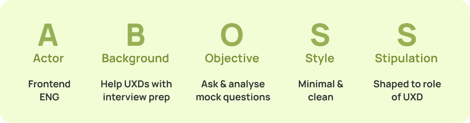
Crafting the initial prompt
-
You are a Senior Principal UX Engineer and Design Systems Expert. You specialize in creating clean, minimalist, and highly functional React applications.
-
We are building "QUIP" (short for Qualitative UX Interview Prep) an interview prep tool for UX designers. The main functionality of this tool is to ask the user a UX interview question, analyse the answer and provide guidance on how to imprvove. The goal is to reduce anxiety through a "soft minimalist" UI that focuses on typography and whitespace rather than heavy borders or cards.
-
Build a single-page React application with the following flow:
1. Setup Phase:
User selects seniority (Junior, Mid, Senior, Lead).
User selects the "Interview Round" (Initial Screen, Hiring Manager, Case Study, Cross-functional, Behavioural).
Optional text area to "Paste Job Description" (not mandatory).
2. Interview Phase:
Display one question at a time in large, prominent text. The question should be curated based on the setup phase.
Large, clean text area for the user's response.
Include a "Microphone" icon (for visual affordance of voice-to-text, even if it just uses the browser's native input).
“Submit Answer" button.
3. Feedback Phase:
A side-by-side layout (Split screen on desktop, stacked on mobile).
Left side: The user's original answer.
Right side: The "Senior Staff UX Mentor" feedback.
Crucial: Use an "Annotation" style for feedback. Highlight or call out specific parts of the user's answer and provide qualitative coaching (e.g., "This part is strong, but try to quantify the impact here").
Buttons: "Retry Question" or "Next Question."
-
Typography: Use the 'Manrope' font (Google Fonts). Headings should be semi-bold, body text should be highly legible with generous padding.
Aesthetic: "Modern Fresh Minimal." No heavy shadows or thick borders.
Physics: Use Framer Motion for smooth transitions between the setup, questions, and feedback. No abrupt layout shifts.
Tone of Feedback: Take on the personality of QUIP, a kind, validating, yet rigorous staff-level UX designer. All of the feedback provided should give evidence, provide examples and be overall actionable.
Data: Use the sample questions listed below as a baseline but instruct the LLM logic to generate unique variations based on the selected round.
-
Mobile-first, responsive design.
Accessible (WCAG AA) contrast and ARIA labels.
Use Google Icons for iconography.
Vibe coding
Screenshot from AI Studio, where I built QUILL (formerly known as QUIP)
Optimising for mobile
QUILL is build around the idea that UXers will practice with any little bit of time they have free. Because of that, the app is build with mobile in mind and only asks one question at a time.
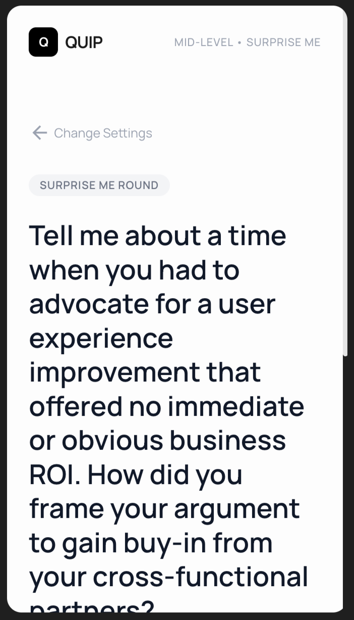
1st iteration: Text input field and button are hidde, does not perform well for longer questions.
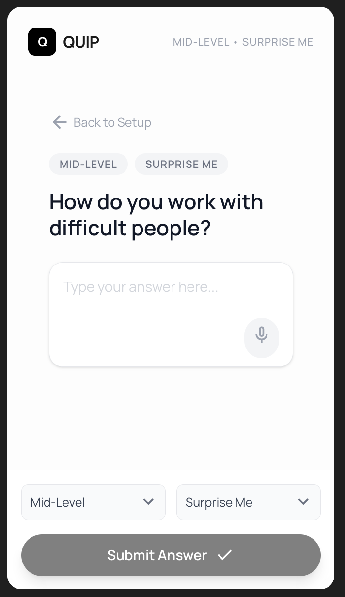
2nd iteration: Pulled all of the features above the fold but does not make good use of vertical and horizontal space.
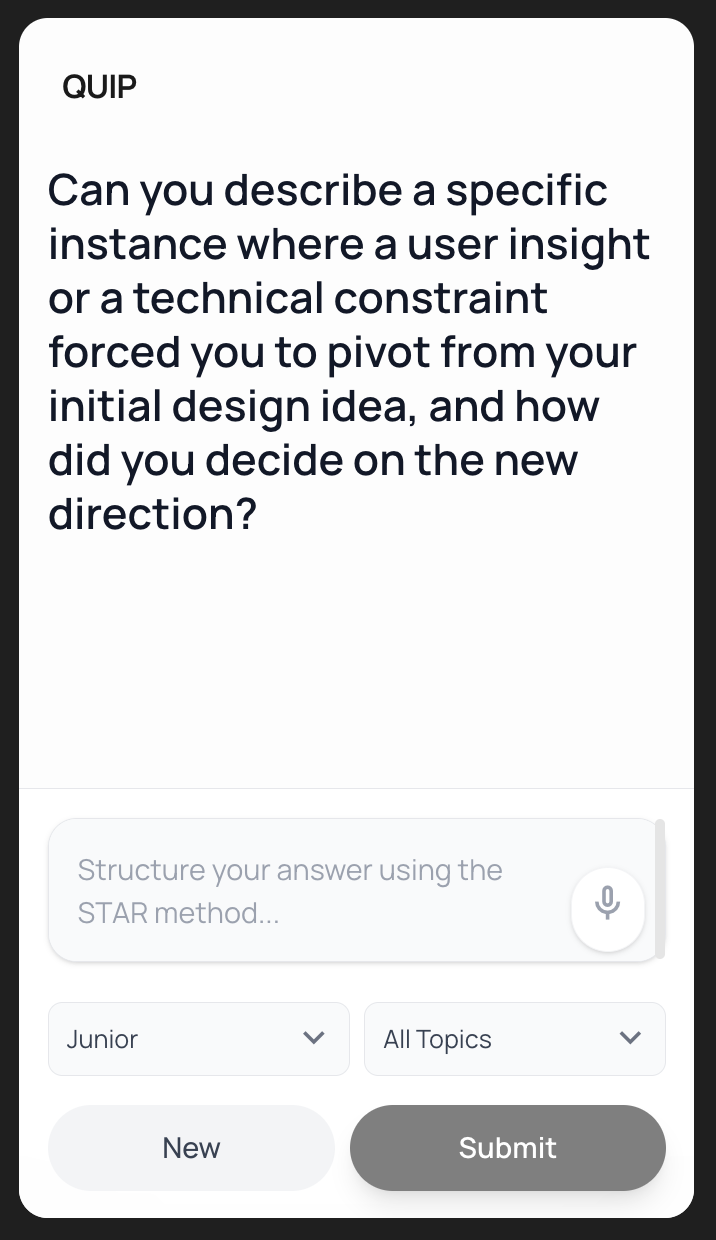
3rd iteration: Clean up of redundant metadata and optimised for touch areas.
Improving waiting periods
The user is spending a lot of time waiting for the AI-generated analysis to load. To make this dead time more useful, I asked the agent to display helpful tips & tricks that are related to the UX interview process. This are stored so that they can load on demand.
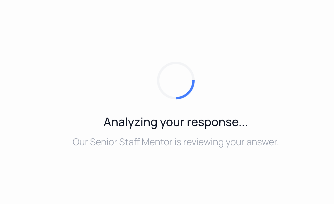
Before: Simple loading icon with unhelpful text
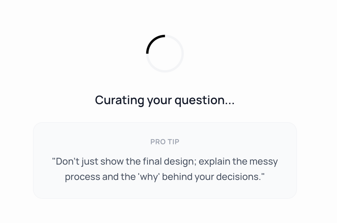
After: UX tips & tricks are displayed and cycled to stay fresh
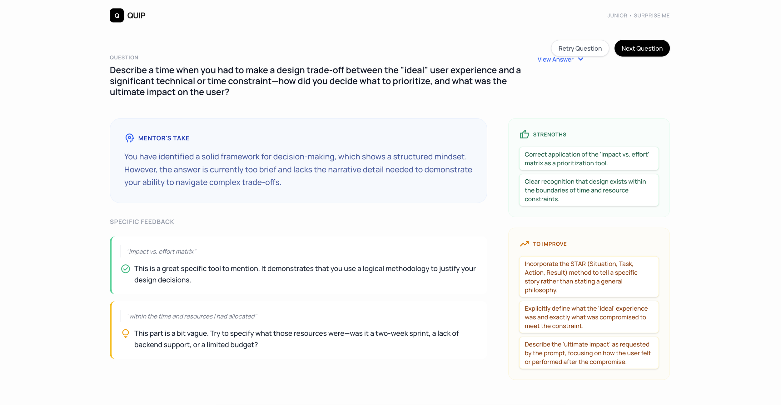
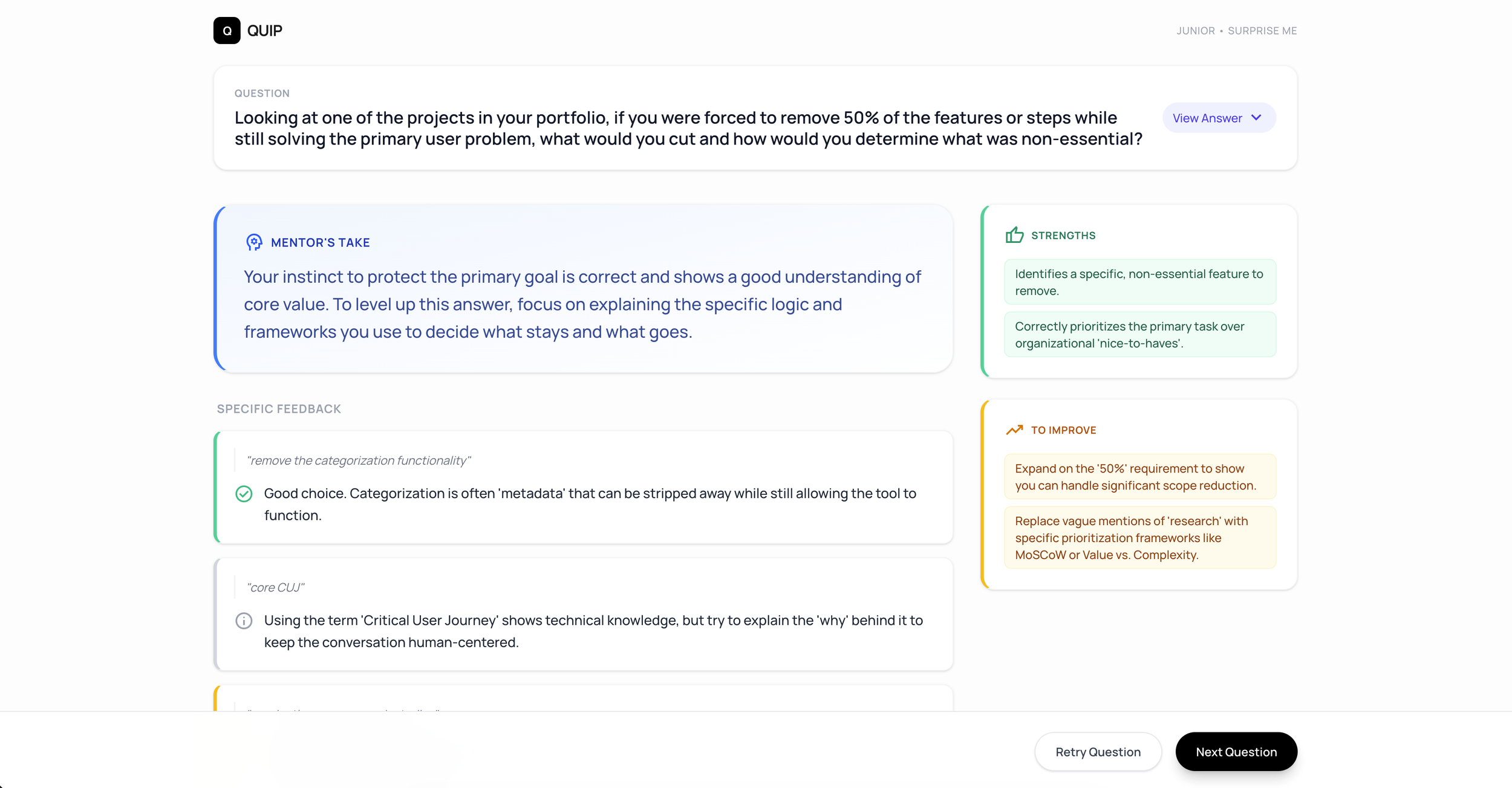
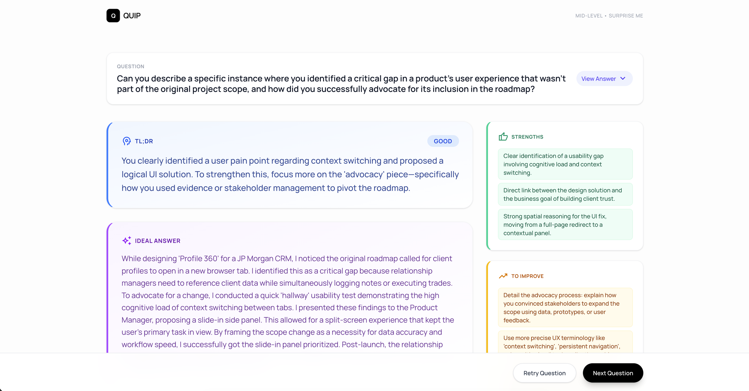
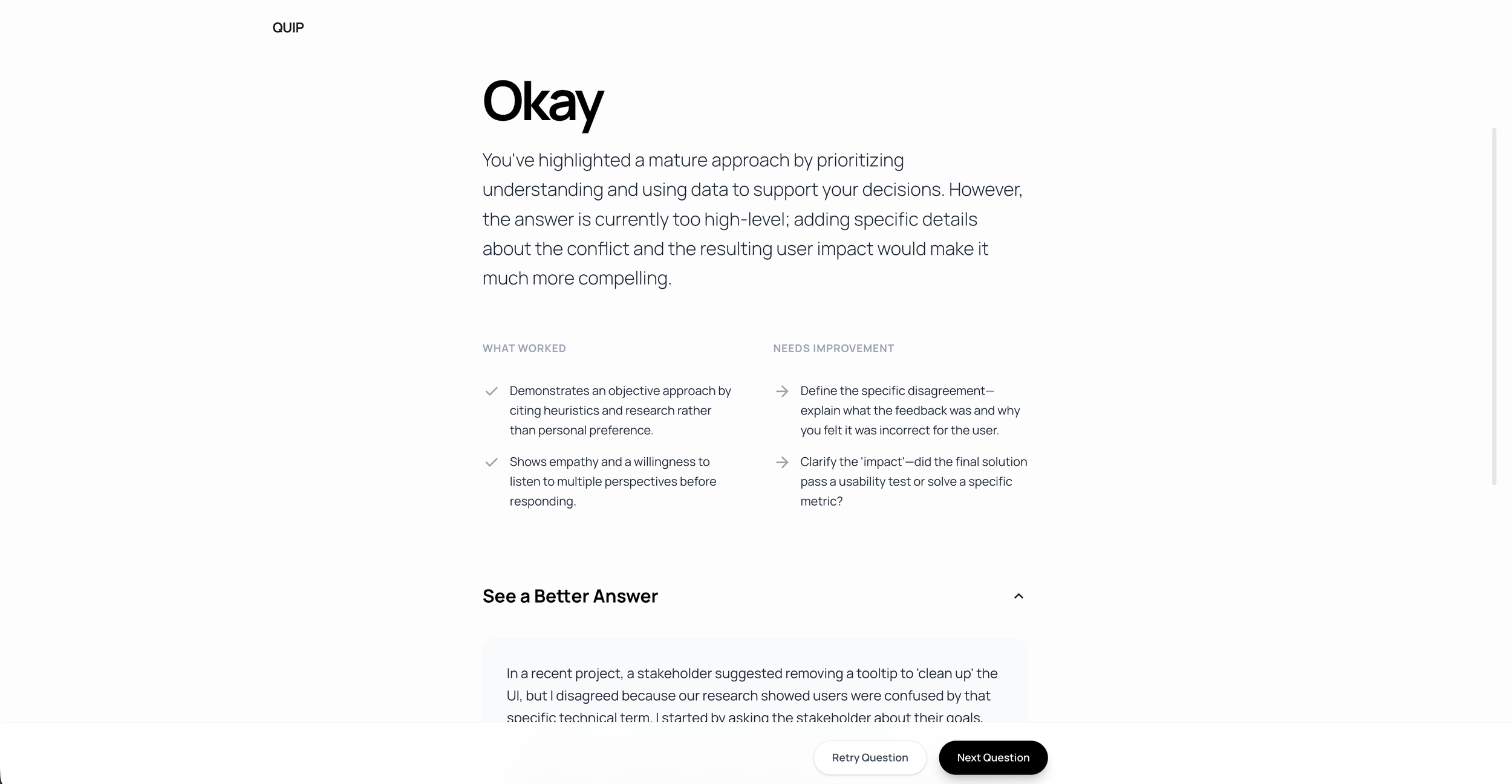
Iterating on the analysis screen
I spent many iterations trying to make the analysis screen the most valuable for users.
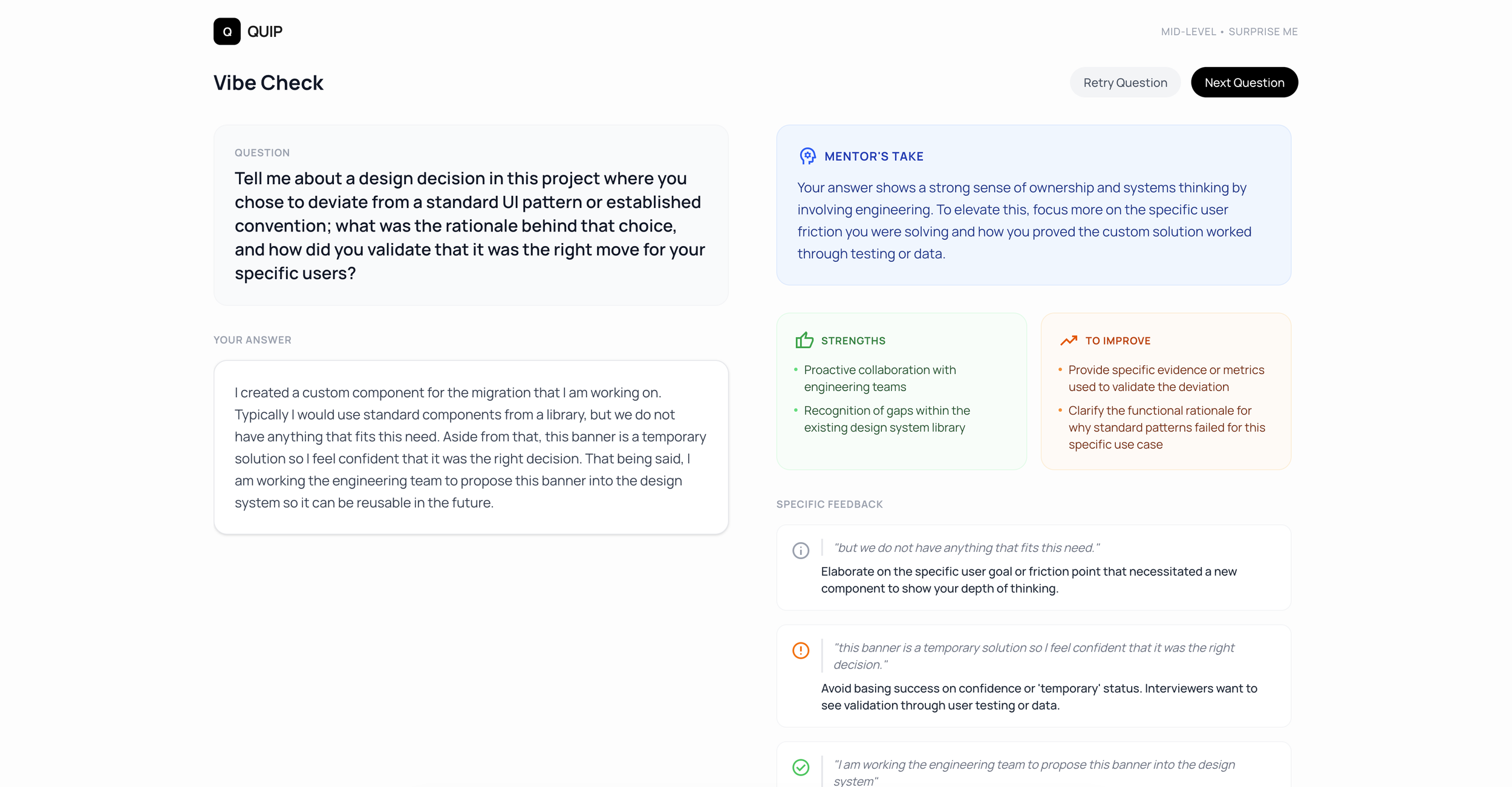
Applying styling
Providing logo / branding guide
Integrating dark mode
Debugging
Latency
To improve the perceived waiting time for users, start generating the question before the user clicks anything. This should be done on the backend so that when the user does click the button, the question will load very quickly.
Gemini API issues
I ran into a lot of issues with loading the AI analysis and feedback. This ended up being due to an issue with the connection to the Gemini API. I resolved it by asking AI Studio to remove the touchpoint and then re-add it using engineering best practices.
Getting Feedback
Heuristic Evaluation
I attached a demo video of my prototype to an AI agent and then provided a prompt that analyses against Jacob Nielsen’s 10 Heuristic Principles and provides guidance on how to improve. Here is the guidance I received:
Overall Rating: High Usability The app is highly intuitive and focused. It successfully bridges the gap between a "mock interview" and "actionable coaching."
Heuristics to improve
User Control and Freedom: Users can navigate back via the "Change Settings" link if they want to restart. A more flexible system would allow an "on-the-fly" adjustment (e.g., a small dropdown or toggle on the question page).
Consistency and Standards: Duplication of metadata. Usually, the top right is reserved for global status or account info, while the area above the main content is for "contextual" info. Using both makes the user's eye jump back and forth, wondering if there is a subtle difference between the two labels that they might be missing.
Aesthetic and Minimalist Design: Utilize vertical and horizontal space more efficiently to showcase the content better.
Outcome
Next steps
Making the voice experience less jarring
Adjusting the styling & dark mode
Testing with UX designers
Learnings
Coming soon… Still collecting my thoughts…
