Grape Job
TL;DR My friend challenged me to recreate a visualization for global wine production.
Background
While having a coffee with a friend and fellow UXer, Mario Callegaro, we discussed the limitations of current-day AI tooling for recreating data-heavy yet beautiful visualizaitons. Mario showed me a gorgeous visual for the 2024 Global Wine Production that uses a photorealistic graph with the size of the grape relating to the production of wine per country.
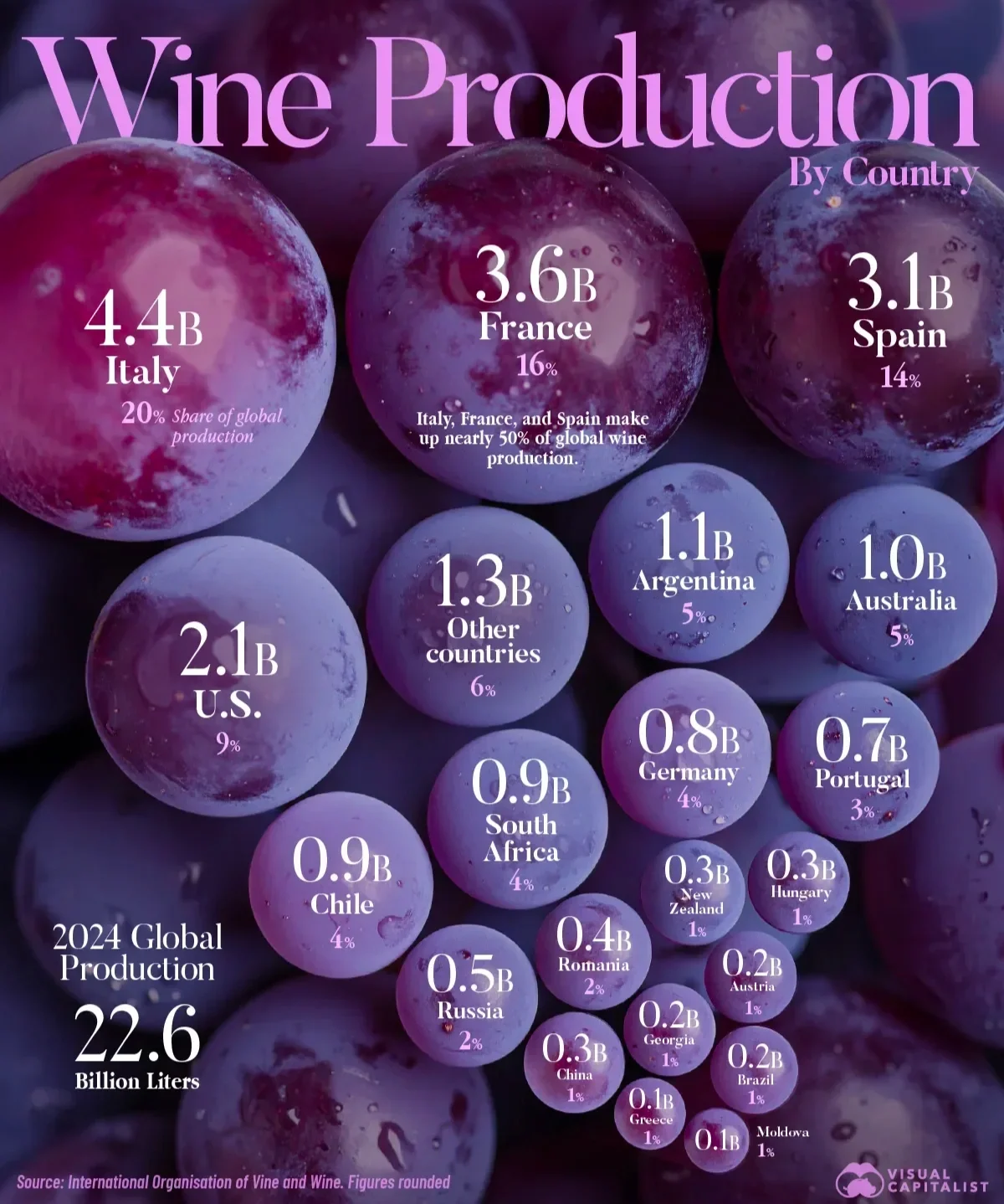
The original inspiration
HMW recreate this bespoke wine production data visualization with modern AI tooling?
Mario’s Attempts
Mario attempted to recreate this data viz several times and describes his journey in two separate blog posts, outlining his methods, setbacks, and eventual insights:
Mario’s 1st iteration with Nano Banana
Mario’s 2nd & 3rd iterations with ChatGPT & Claude
Process
Standardize the Data
To ensure the AI tooling has the best chance at recreating the grapes accurately, Mario created a .csv file to host the original data. This can be used as an attachment when prompting.
Initial Prompt
You are a front end engineer that specializes in data visualization. Create an interactive infographic about the wine production by country from 2024 (based on the attached .csv file) represented as a realistic bunch of grapes. Each grape represents a country and the size of the grape is determined by the percentage of wine production. Make sure to add a key so the user can easily understand the visualization. It is vital that the information and sizing is correct.
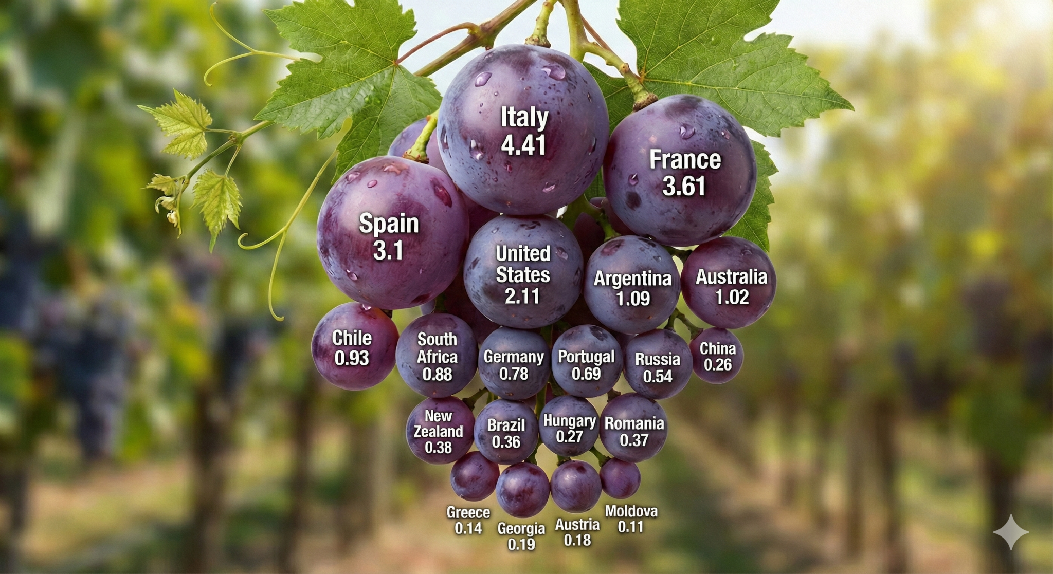
Output V1: Wine Production by Country
Elizabeth’s 1st iteration of the 2024 Wine Production
Expanding the Scope
Locating Additional Data
Now that I had successfully created the first version, I wanted to expand to include other types of insights. I located the original PDF file for the State of the World Vine and Wine Sector and analyzed which insight might be the most interesting to share in a story format.
Expanded Prompt
You are a data scientist that specializes in data visualization. Parse the attached PDF about viticulture and then determine which parts would make captivating infographics. Then expand the current app to have more statistics for the user to explore.
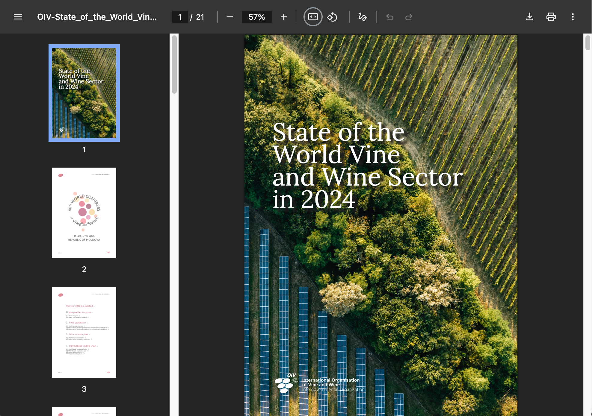
Source of Truth: State of the World Vine & Wine Sector for 2024
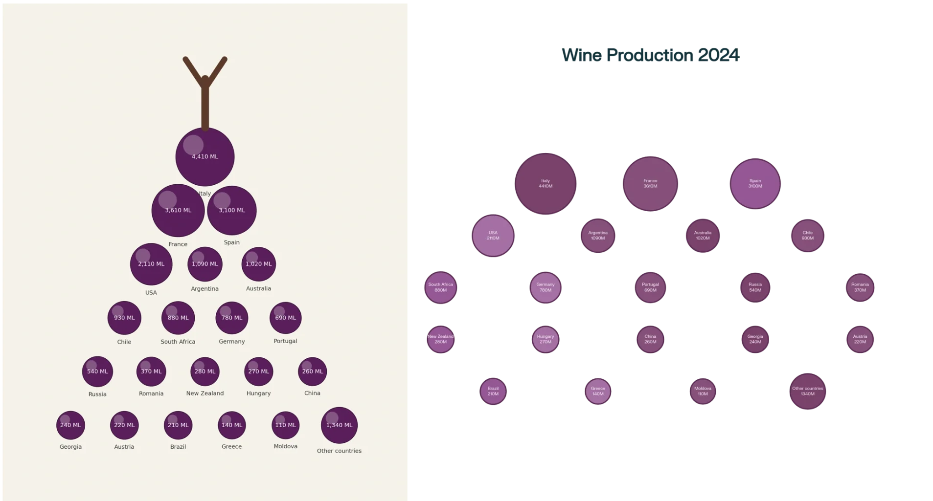
Output V2: The Viticulture Report
Elizabeth’s 2nd iteration of the grape visualization